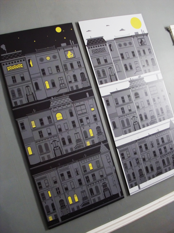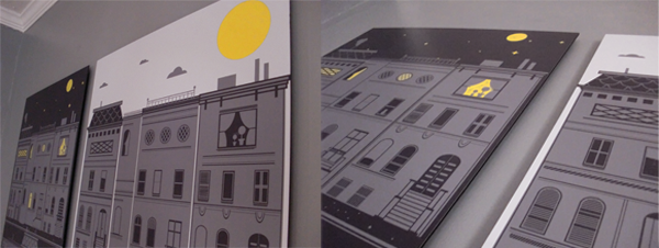

There's nothing quite like being given a project & theme, and then told to "just run with it". It can be like a fresh breath of air. So when I was commissioned to do an illustration involving city living, I went back to an idea I had sketched out months previous, featuring brooklyn inspired homes, crammed together, but showing several streets stacked one upon the other. The question then began, whether or not to set it at night or during the day. Well, why not just do both? The addition was then approved, and so began the task of creating the buildings, windows, rooftops, etc... one peice at a time. All with a tip of the hat to mid-century modern illustrations.

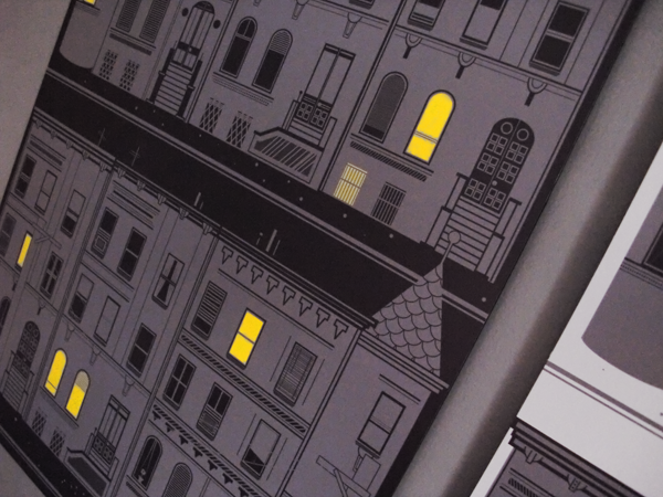
I wanted to keep signs of everyday life to a minimum. A plant in a window, someone's cat, unevenly drawn window shades, or a light left on, leave only hints that everyday life exists within the walls of these structures. I even wrestled with the idea of an airplane seen up in the clouds, but felt it was too personal. I decided to rely on shades of grey, with the subtle pop of yellow. Very minimal, yet painstakingly detailed.
