I was asked earlier this year to create a piece for a show entitled troublesome Houses, an exhibition inspired by the music of Will Oldham. I've listened to Bonnie Prince Billy for years, so it was a no brainer. One of my favorite songs of his is called "I see a Darkness" which has been reworked many times over the years including a cover by Johnny Cash. I wanted to create a piece that centered around the title, set against a swirling storm.
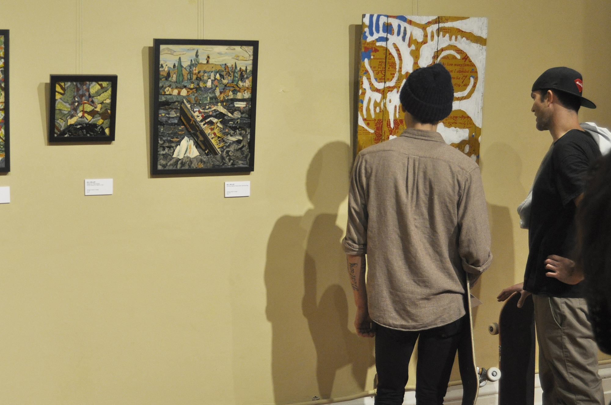
I used the opportunity to experiment with acrylic, designing a dimensional piece, seven layers deep. Needless to say I was extremely pleased with the final result. Kevin Titzer curated an amazing show, which kicked off it's opening night last friday. The show will be on display thru December 14th at PUBLIC Gallery 131 W. Main St. Louisville, KY.
Work by all the artists can be seen here.


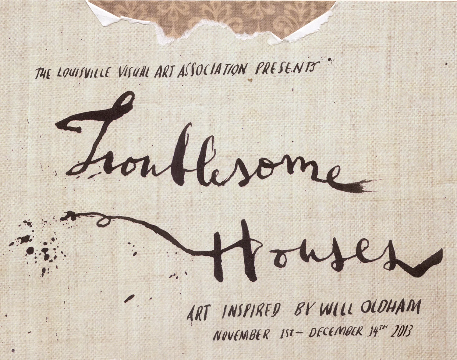


24in x 17in Laser cut acrylic